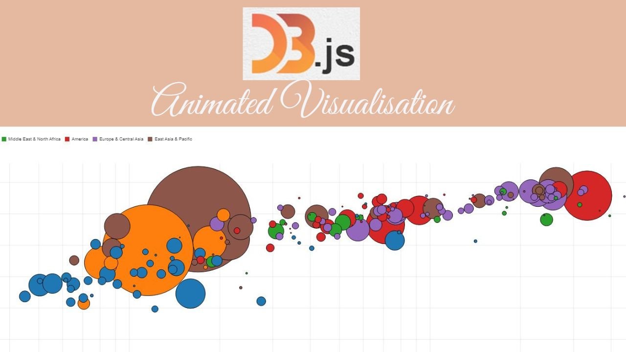
Animated Scatter Plots charts can be valuable in several scenarios from showcasing changes over time, breaking complex information into digestible parts, storytelling, illustrating relationships between multiple variables, to user interaction and exploration by gaining deeper insights. It can significantly enhance the understanding and engagement of an audience.
In this scenario, it shows the per capital income patterns , life expectancy and population, highlighting the changes over a long period of time. With each region showing a different colour. This offers a dynamic way to represent multidimensional data, making it easier to observe patterns , trends that might not be immediately apparent in static visualisations.
Other Potential Use Cases:
- Stock Market Analysis: illustrating the movement of stock prices to trading volume over time to identify trends, patterns, anomalies in the market.
- Marketing and Consumer Behaviour: Showing correlations between advertising, spending and sales figures over months or years, indicating the impact of marketing efforts on consumer behaviour.
- Economic Trends: Displaying changes in economic indicators like GDP growth versus unemployment rates over several years. The animation can reveal correlations or trends that evolve over time.


can i buy cheap clomid price where to buy generic clomiphene tablets clomiphene bula profissional clomid tablets price in pakistan where buy generic clomid tablets can i purchase generic clomid without a prescription generic clomid price
More posts like this would force the blogosphere more useful.
Palatable blog you be undergoing here.. It’s intricate to find high status belles-lettres like yours these days. I truly appreciate individuals like you! Go through care!!
zithromax oral – flagyl 200mg tablet buy flagyl 200mg for sale
purchase rybelsus generic – order semaglutide for sale order cyproheptadine 4 mg
buy motilium 10mg for sale – domperidone online buy buy flexeril medication
buy inderal 20mg online cheap – cost methotrexate 5mg purchase methotrexate online cheap
buy amoxil pills – amoxicillin cost buy ipratropium 100 mcg for sale
buy azithromycin online – buy generic azithromycin bystolic generic
cost augmentin – at bio info ampicillin order online
order nexium pills – https://anexamate.com/ nexium 40mg sale
purchase medex – https://coumamide.com/ buy cozaar 25mg sale
order meloxicam 7.5mg for sale – https://moboxsin.com/ mobic 7.5mg drug
prednisone 10mg generic – https://apreplson.com/ buy prednisone paypal
best drug for ed – https://fastedtotake.com/ pills for ed
amoxil where to buy – https://combamoxi.com/ oral amoxicillin
where to buy diflucan without a prescription – https://gpdifluca.com/# diflucan cost
cost cenforce 50mg – https://cenforcers.com/# cenforce 100mg canada
cialis from india – site tadalafil professional review
how many mg of cialis should i take – https://strongtadafl.com/ do you need a prescription for cialis
zantac 150mg oral – zantac price ranitidine 150mg for sale
dapoxetine 60 mg sildenafil 100mg – https://strongvpls.com/ viagra cialis pills
Thanks an eye to sharing. It’s first quality. online
The depth in this piece is exceptional. https://buyfastonl.com/azithromycin.html
This is the description of content I get high on reading. https://ursxdol.com/doxycycline-antibiotic/
This website absolutely has all of the information and facts I needed about this thesis and didn’t know who to ask. https://prohnrg.com/
More posts like this would force the blogosphere more useful. https://aranitidine.com/fr/acheter-propecia-en-ligne/
Thanks for putting this up. It’s well done. https://ondactone.com/product/domperidone/
More delight pieces like this would create the интернет better.
order methotrexate online cheap
More posts like this would create the online time more useful. http://seafishzone.com/home.php?mod=space&uid=2294009
forxiga drug – https://janozin.com/ how to buy dapagliflozin
xenical cheap – order xenical pills buy orlistat paypal
More articles like this would make the blogosphere richer. http://ledyardmachine.com/forum/User-Jdinys
More articles like this would pretence of the blogosphere richer. TerbinaPharmacy
I’ll certainly bring to read more.
71 Games, 22 Wins… those are promising numbers! I’m always on the hunt for new games. Let’s take a look at 71games22wins and see if I can add to that win count!
J9app! Another app to try? 🤔 Is the mobile gaming experience smooth af? Or just another battery-draining headache? Spill the tea! More info here: j9app
Trying to log into Luvabet and this login page seems pretty straightforward. No weird glitches or redirects like some other sites I’ve used! That’s always a win! Fingers crossed the rest of their site is as smooth and reliable. Time to log-in : luvabetlogin
Heard about uujllogin from a buddy, and gotta say, it’s pretty decent! Quick access, no annoying lag so far. Definitely bookmarking this one! Check it out here: uujllogin
I noticed it’s published on January 8, 2024. That’s pretty future-forward for posting! The use of animated scatter plots to show patterns of income, life expectancy and population is fascinating
best free online gambling sites
online slots win real money
online casino game
betmgm Illinois mgm online gambling betmgm
Immerse in the symphony of spinning reels and cheering wins. In crown coins casino official website, cashback offers soften any losses. Spin with confidence today!
Sweet Bonanza combines eye-popping visuals with high-volatility excitement that sweet bonanza real money keeps players coming back. Free spins round loaded with up to 100x multipliers = pure adrenaline. Join the candy craze!
Feel the primal pulse of pure payout power. bull and games features 1024 lines, retriggers, and buffalo gold jackpots. Conquer!
chumba casino free sweeps: free to play, real money to win. Get your welcome Sweeps Coins bonus and experience the ultimate social casino. Start now!
stake esports isn’t chasing trends — it sets them. Fastest growing crypto casino for a reason. Come see why.
DraftKings blackjack Casino: Thrills without the risk. New users score 500 spins after $5 + up to $1,000 lossback protection. Discover why players choose us!
Chytry nakup leku = az 80 % uspora. Zacnete hned!
https://opravdovalekarna.cz
Upon the millions winning big on fanduel casino North Carolina – the #1 natural pelf casino app in America.
Get your $1000 WITH IT AGAIN gratuity and deny b decrease every spin, hand and somersault into legitimate readies rewards.
Firm payouts, gigantic jackpots, and continuous activity – download FanDuel Casino again and start playing like a pro today!
PrГЄt Г gagner gros ? Rejoignez Betano https://betanogame.org/fr/ dГЁs aujourd’hui et dГ©bloquez un incroyable package de bienvenue d’une valeur allant jusqu’Г 500 €. Jouez aux jeux de casino les plus populaires de NetEnt, Pragmatic Play et Evolution Gaming. Avec des retraits rapides et une assistance 24h/24 et 7j/7, votre aventure commence maintenant chez Betano.
Registre-se no Mostbet e comece com saldo muito maior agora mesmo – https://mostbetpt.pro/ , Mostbet: mais emoção, mais jogos, mais recompensas para vocГЄ .
Spin until even RNG starts taking notes – https://buyaristocopt.com , The jackpot is nervous — it heard you were coming .
Expertise pharmaceutique et sourire sincГЁre pour vous servir – https://www.pharmacieprovidencevifane.com/mentions-legales/ , SantГ© pour tous, Г tout Гўge : bienvenue dans notre pharmacie .