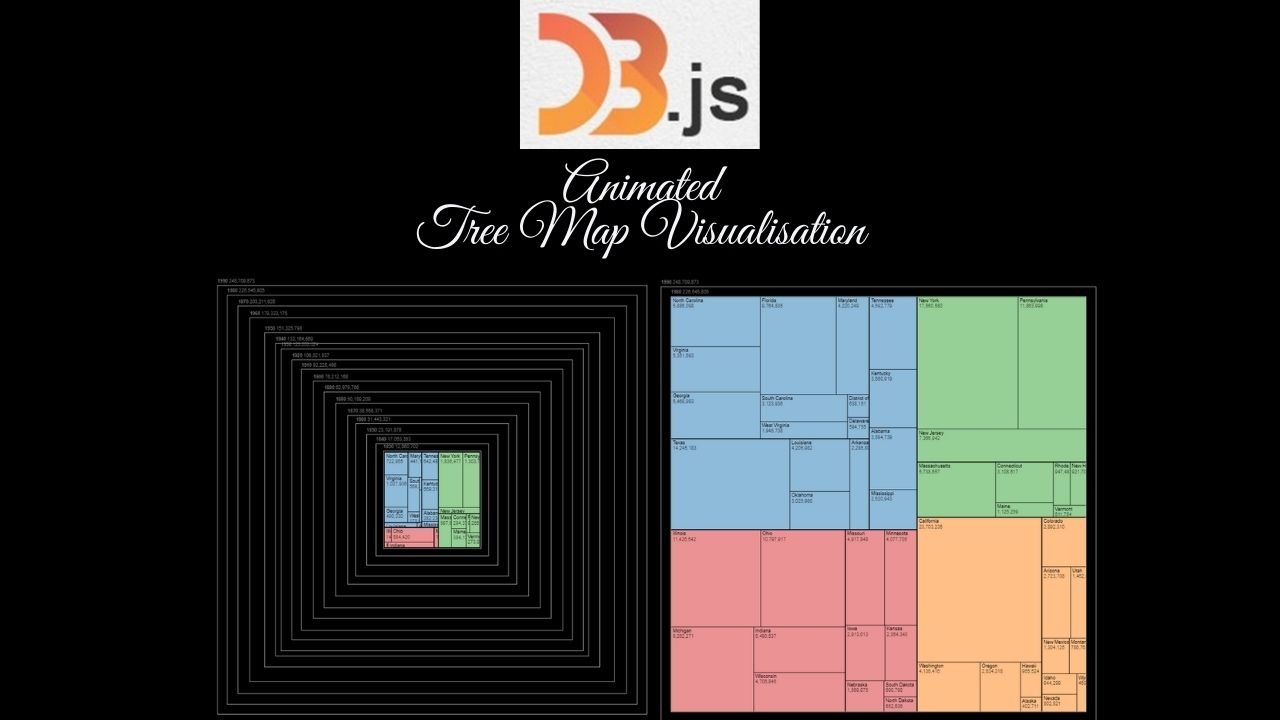
The animated tree map offers a concise and visually appealing way to represent hierarchical data. The size of the rectangle within the tree map corresponds to the proportion for magnitude of the category it represents, making it easy to compare and understand the relative importance or size of different segments within the whole dataset.
In this scenario, it is used to visualise the U.S Population changes over time.
Other Potential Use Cases:
- Resource Allocation and Budgeting: illustrating budget allocations across departments or projects within an organisation over quarters or fiscal years, highlighting shifts in priorities.
- Healthcare Analytics: Displaying the distribution of medical conditions or diseases within demographic groups, showcasing changes in prevalence over years or decades.
- Inventory Management: Showing changes in inventory levels across different product categories or warehouses over time, aiding in inventory optimization and identifying trends in demand.
- Risk Analysis: Representing the distribution of risks within a project, business, or portfolio, allowing stakeholders to prioritise areas that requires attention.


clomid buy clomid reddit how to buy clomid pill can i buy clomid price where buy generic clomiphene tablets can i buy clomid price order generic clomiphene pills
More posts like this would add up to the online play more useful.
I am in point of fact delighted to glitter at this blog posts which consists of tons of of use facts, thanks towards providing such data.
zithromax 250mg price – ofloxacin 200mg canada flagyl 200mg ca
order semaglutide generic – order rybelsus generic periactin sale
buy domperidone medication – flexeril pills flexeril cheap
inderal 20mg cost – buy generic propranolol for sale order generic methotrexate 10mg
cheap generic amoxicillin – buy generic ipratropium buy combivent 100mcg generic
azithromycin 250mg generic – buy tinidazole 300mg sale generic bystolic
amoxiclav over the counter – https://atbioinfo.com/ how to buy ampicillin
order esomeprazole 20mg pill – https://anexamate.com/ order esomeprazole without prescription
cost warfarin 2mg – anticoagulant cozaar 25mg brand
purchase mobic pills – https://moboxsin.com/ generic mobic 15mg
prednisone 5mg brand – aprep lson purchase prednisone online cheap
ed pills no prescription – https://fastedtotake.com/ natural ed pills
where to buy amoxil without a prescription – https://combamoxi.com/ amoxil medication
buy diflucan without prescription – https://gpdifluca.com/# diflucan 100mg pills
buy cenforce cheap – click buy cenforce 100mg pills
where to buy cialis over the counter – cialis for pulmonary hypertension cialis 5mg daily
ranitidine 150mg uk – https://aranitidine.com/# buy ranitidine 150mg generic
how long does cialis last in your system – purchase cialis online cheap how to take liquid tadalafil
More content pieces like this would insinuate the web better. https://gnolvade.com/es/fildena/
sildenafil citrate tablets ip 50 mg – click is it legal to order viagra from canadian
This is the compassionate of criticism I truly appreciate. azithromycin 500mg tablet
This is the stripe of content I have reading. https://ursxdol.com/clomid-for-sale-50-mg/
I couldn’t resist commenting. Profoundly written! https://prohnrg.com/product/lisinopril-5-mg/
The vividness in this piece is exceptional. https://aranitidine.com/fr/viagra-100mg-prix/
I couldn’t weather commenting. Warmly written! https://ondactone.com/product/domperidone/
This is the kind of criticism I truly appreciate.
https://proisotrepl.com/product/domperidone/
Thanks towards putting this up. It’s understandably done. http://sglpw.cn/home.php?mod=space&uid=563606
generic dapagliflozin 10 mg – on this site dapagliflozin over the counter
purchase orlistat online cheap – orlistat over the counter orlistat 60mg sale
I am actually thrilled to glance at this blog posts which consists of tons of useful facts, thanks for providing such data. http://www.orlandogamers.org/forum/member.php?action=profile&uid=29971
You can keep yourself and your dearest by way of being wary when buying prescription online. Some pharmaceutics websites operate legally and provide convenience, solitariness, sell for savings and safeguards as a replacement for purchasing medicines. buy in TerbinaPharmacy https://terbinafines.com/product/zantac.html zantac
I am actually happy to glitter at this blog posts which consists of tons of of use facts, thanks for providing such data. TerbinaPharmacy
I’ll certainly carry back to review more.
Yo! I’ve been messing around with 98bet lately. The odds seem pretty competitive, and the platform is smooth. Deposits and withdrawals were easy too, which is a huge plus in my book.
Ta28bet? Heard about it from some buddies. Solid platform, nothing crazy, just good ol’ reliable fun. Definitely worth checking out if you’re looking for a decent gamble. Give it a go? ta28bet
Ugh, dealing with tclotteryloginproblem AGAIN. Seriously, these login issues are a pain. Anyone else having the same problem? Hoping for a fix soon! See more here: tclotteryloginproblem
Okay, so I stumbled upon ggbetreview and gotta say, it’s pretty decent for getting the lowdown. Layout is tidy, easy to navigate, and they seem to know their stuff. Definitely worth a look before you dive headfirst into any bets. Check it out here: ggbetreview
I?¦m no longer sure where you’re getting your information, but good topic. I needs to spend a while finding out much more or working out more. Thank you for magnificent info I was searching for this information for my mission.
Just checked out ae888ap88 and it’s looking pretty slick! Gotta say, the games seem legit and the site’s easy to navigate. Might just give it a shot. Check it out yourself: ae888ap88
Alupohcasino, eh? Never heard of it before. But hey, a new casino is always exciting! Time to explore what alupohcasino has to offer.
789bme… Now that’s a catchy name! Hope their games are as good as their branding. Let’s give 789bme a shot and see if they’re lucky!
Good site! I really love how it is simple on my eyes and the data are well written. I’m wondering how I could be notified when a new post has been made. I have subscribed to your RSS feed which must do the trick! Have a nice day!
betmgm 200 free bets betmgm-play betmgm Р Рђ
Open new facets of excitement with us. In crown coins casino online, exclusive games and jackpots are available. Play smart and win big!
Get ready for sugary chaos in Sweet Bonanza — the slot that pays everywhere! Multipliers sweet bonanza xmas demo stack during bonuses for jaw-dropping wins. Play free or real money now!
Charge into chaos for controlled chaos wins. buffalo deluxe delivers herds of wilds, scatter triggers, and golden glory. Play now!
Join thousands winning daily at chumba casino. Sign up now for your free Sweeps Coins bonus and dive into premium slot action. Real prizes — real fun!
Crash at x100? Possible on Stake. Thousands already stake withdrawal time cashed out life-changing wins. Your turn is next.
Step up to kings maxxwins Casino today. Play $5, receive 500 Cash Eruption spins + up to $1,000 lossback. The ultimate online casino experience!
Opravdovalekarna.cz – kde se kvalita nepotkava s vysokou cenou
opravdovalekarna.cz
Solder together the millions delightful big on fan maxxwins – the #1 real in dough casino app in America.
Get your $1000 TEASE IT AGAIN hand-out and turn every make up, hand and somersault into real coin of the realm rewards.
Permanent =’pretty damned quick’ payouts, gigantic jackpots, and day in action – download FanDuel Casino in these times and start playing like a pro today!
Sinta a adrenalina no Betano https://betanogame.org/pt/. Novos jogadores ganham até €500 de bônus mais rodadas grátis nos jogos populares. Aposte nos seus esportes favoritos ou gire os rolos 24/7. O Betano entrega entretenimento sem parar e grandes pagamentos.
No Mostbet cada novo jogador comeГ§a com uma vantagem gigante esperando por ele – https://mostbetpt.pro/mostbet-app/ , Entre no Mostbet e aproveite um comeГ§o de jogador VIP .
Your winning era begins the second you join – http://calcitriolc.com/mostbet-casino-analise-completa-2026-do-especialista-em-igaming/ , Play like someone already owes you a fortune .
Pharmacie Г votre service : soins, bien-ГЄtre et disponibilitГ© 7 jours sur 7 – https://saintpierremagnycours-tourisme.jimdofree.com/associations-commerces-services/commer%C3%A7ants-services/pharmacie/ , DГ©couvrez notre pharmacie oГ№ votre santГ© est notre prioritГ© absolue .